You’re thinking of getting a new website done for your business and you keep hearing the buzzwords “Responsive Web Design” thrown around. Sure, it sounds great, but is everyone talking about the same thing?
Think to yourself, for a moment, about the time you’ve spent browsing websites on desktop and on your mobile device. How similar have your experiences between the two been?
Let’s look at the differences between desktop and mobile from a structure standpoint:
Desktop:
- Reading: Desktop screens are wider, so we’re more likely to read the information from left to right, and then from top to bottom. Knowing this, an optimized desktop layout can show more valuable information on the left side of the screen.
- Passive Consumption: Desktop websites have more room to play with, which means including passive elements like background videos, hover effects, and scrolling effects can greatly increase the immersion and interaction of the viewers.
- Show Off: Not only can you inspire your viewers to interact more—the extra space allows you to really show off. Use the space to showcase what sets you apart in your industry and ensure you stay top of mind when the time comes for your customer to purchase.
Mobile:
- Scrolling: A common theme in these three points come from how Social Media has evolved. Mobile websites are skinnier and taller, which means we will spend much more time scrolling through the pages looking for specific content.
- Touch: On mobile, we have to interact with our fingers, which means the things we touch had better be large enough to interact with easily. You remember the last time you tried clicking on one of three super skinny buttons stacked right on top of each other, don’t you?
- Swiping: From the overall interface of your phone’s app screens to those long nights on Tinder, we’ve learned that swiping left and right will get us where we need to go. Have you ever come across a photo gallery on a phone that wouldn’t swipe through images and you had to click the arrows? What is this, the middle ages?
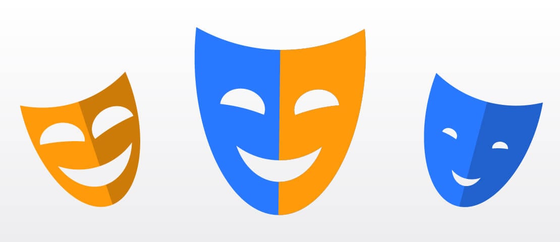
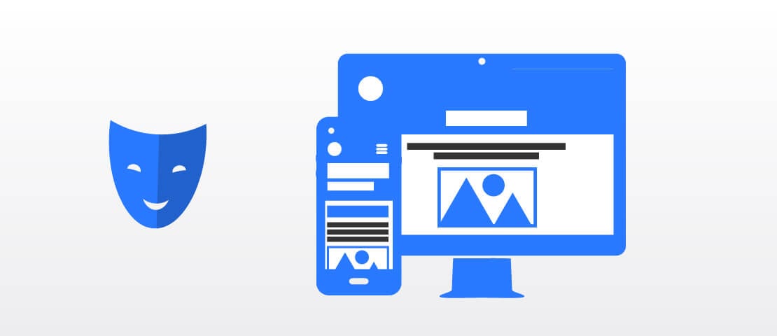
Below are the three faces of responsive web design. We’ll call them Cluttered, Sparse, and The Twins.
Cluttered
This is the face you get when you try to take a website that looks fantastic on desktop and jam it into mobile dimensions. Sure, you’ll probably get all of the information in there, but you may run into one or more of these problems:
- Hover Effects: If you have elements that transform on your desktop, such as buttons that change from an icon to the wording, what you’ll end up with is a customer who has to guess that the icon of the cardboard box means you offer moving services. If they have to click on these buttons to find out, they’ll probably leave before clicking a second time.
- Excessive Scrolling: You’ve got a neat display of 8 of your products in 2 rows of 4. However, in order to show the necessary amount of detail on mobile, you’ve decided to stack them all in a single-file column. Are your customers willing to scroll past pages of products to get to the next section?
- Oceans of Text: A sentence that takes up 1 line on desktop might become 2 or 4 or 6 lines on mobile. What may be a short company history on your home page becomes what feels like pages and pages to scroll past on mobile. People tend to avoid reading long blocks of text, which means you run the risk of your viewer looking elsewhere.
Sparse
The lesser-known cousin of Cluttered. This is the face you get when your responsive web design goes the opposite direction; stretching fantastic mobile designs into desktop dimensions. You aren’t going to suffer from the above issues, but you may be missing out on huge opportunities.
- Empty Pages: Mobile design helps direct people to the correct places quickly, which usually means there isn’t a lot of fluff to hold their interest along the way. Stretching out your mobile content may mean there’s just too much for them to do. The content and calls to action are there, but you’ve lost the ability to guide them.
- Strategic Calls to Action: A well optimized desktop website will have well-placed calls to action to convert viewers as they browse through content. Mobile design may include some great calls to action, but putting them in the correct places on desktop is a very different art.
- Forgettable: Mobile design by necessity must be more compact and simple, which means your desktop website will suffer from the loss of memorable and interactive elements. Are you missing out on side-by-side comparisons? Do your viewers feel immersed in a single moment or concept as they stumble upon the content they were looking for? If you belong to an industry where your customers look through all of your competition before making a buying decision, are they going to remember you at the end of the day?
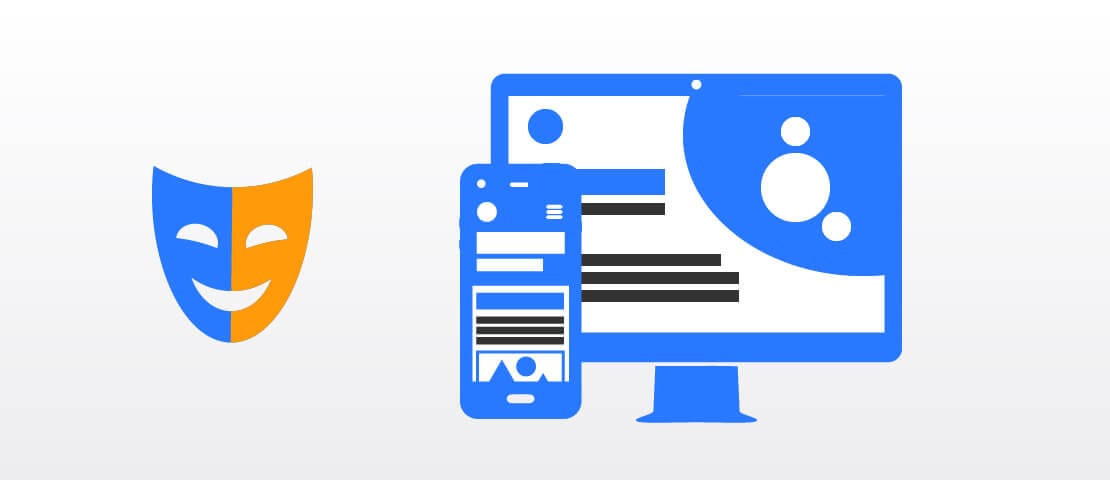
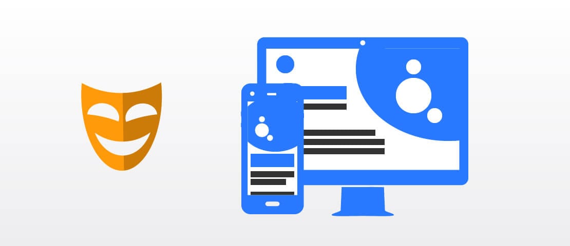
The Twins
And so, we come to our third and final face. As the name suggests, The Twins actually have two distinct, but similar appearances. This face is achieved when your responsive web design accounts for the differences in the two sizes and optimizes for both.
Con: Right off the bat, the trouble this one brings to the table comes in the form of time and money expenses. Of course, if you treat these like two different websites, you can expect the project to be almost twice as large.
Pro: No matter where your viewer is coming from, they’ll be met with the best interface. You can keep them from leaving out of frustration, and the chances are better that you’ll create a more memorable experience for them altogether.
Zack’s Strategy Tip!
In most cases, you don’t need to make your entire website this way. Your most important page is your home page, so you can achieve similar results by paying extra attention here. If someone goes out of their way to click on your About page, it’s fine for them to read through an ocean of text; they probably wanted to.
Work on your first impression and you’ll get ~80% of the value of The Twins for ~20% of the expenses.
You’re finally ready to get started on your new website product. Think hard about how you use mobile and desktop websites, what you like and dislike, and what the minimum amount of content is to ensure a viewer can find what they’re looking for in a matter of seconds.
Remember, you can always reach out to me with any questions you have about the web design process!