Have you ever tried using a shower in a hotel that seemed like alien technology? Have you ever pushed a door when you should have pulled? Most of us have, and today I’ll tell you why this is important to your business and marketing and how you can apply this knowledge to get the most out of your efforts.
We learn how to interact with the world through foundational knowledge (building new information on top of what we already know). This means we can carry on with our day-to-day lives without having to stop and think about every little thing we’re doing.
You may already know that you use muscle memory to improve your performance when you’re learning a new sport, instrument, or game, but you may not have thought about the role it plays in every other thing you do.
Today I want to show you how much your brain (and your customers’ brains) rely on the familiar, and how the key to great design is to understand how to use this familiarity to create a customer experience that feels like second-nature.
Example 1: Alien Shower Technology
Okay, so you’ve got a shower at home that looks something like this:

Or even more obvious, one that has two separate controls for hot and cold (I think these may be considered retro now, though).
You know that you turn it left for hot and right for cold. It’s the same as the two-control ones you grew up with and it’s probably the same as your sink.
But now you’re standing in a hotel looking at this:
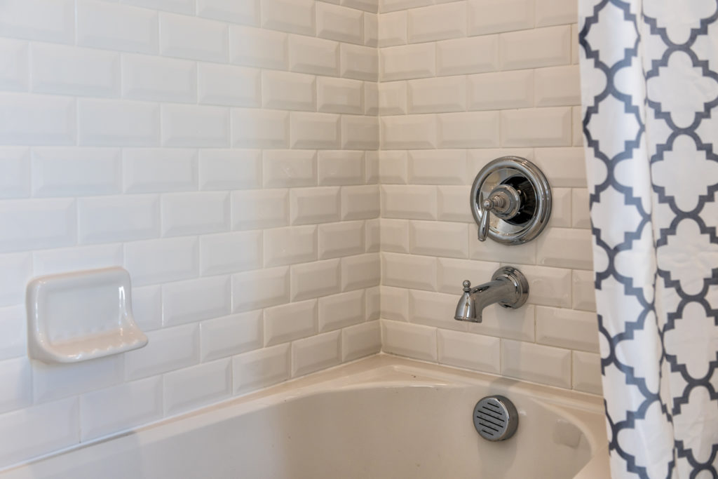
You think to yourself, “Easy—turn it right for cold and left for hot.” But wait, it doesn’t turn left. When you turn it to the right, it’s cold like you’d expect, but then how do you make it hot?
This is the kind of shower I have at home now, so I’m somewhat used to it, but it took me months to find the sweet ¾ turn -past- the cold that gave me the right temperature.
Why would they make you turn past the cold to get the hot? Your sink doesn’t do that, right?
In this case, the foundational knowledge we’ve built up, based on previous shower and sink experiences, is that we turn left for hot and right for cold. To make matters worse, it’s very likely that your muscle memory knows this better than your brain does.
Recently, I was turning on the sink on my kitchen island from behind and I had to ask my wife, “this way is hot, right?” I didn’t know. I’ve done it uncountable times from the front, so I would have thought that it was baked into my brain. But it wasn’t.
I’ll tell you how this relates to design after one more example.
Example 2: Push and Pull Doors
When you look at the following picture of doors, would you think these open by pushing or pulling?

What about when you look at these doors? Push or pull?

Once again, it seems easy. You already know that horizontal bars mean push and vertical bars mean pull, right? But, I don’t see a horizontal bar on the other side of the glass, which means these vertical bars are on both sides.
Could it mean that you can pull from both sides? It could, but in my experience, it never does. My University’s doors were all like this and first-year students found themselves jarring their shoulders tugging at doors that wouldn’t open.
In this last picture, I imagine the tiny little white sign says “push” on the other side. If you read “push”, then obviously you’ll push. But, we don’t actually read these signs as often as the sign-makers assume we will.
If you’ve ever worked in retail, you might have memories like “customers are so stupid, they don’t read the signs” after telling the 500th customer that the self-checkouts don’t accept cash (can you tell this is a personal example?).
The reality is that our brains don’t work this way. It’s not useful for us to stop and think hard about what we’re doing at every sink, door, and checkout lane. We use foundational knowledge (again, building new information on top of what we already know) so that we can move past it and focus our attention on newer, more complex things.
To prove my point, try walking and thinking about your steps “left goes in front of right, then I bend my right knee…” and see what else you can think about at the same time. I bet you can’t think of anything else. Don’t worry, you’re not meant to focus on multiple things at the same time.
How does this relate to design?
As always, I’ll be focusing mostly on websites because that’s the design industry I know best. When we talk about design in the website industry, it’s in two main parts.
- Visual Design – How things look in terms of beauty
- User Interface/User Experience (UI/UX) – How things look in terms of useability
You can have an alien shower for a website: beautiful, but hard to figure out, and you can have complex doors for a website: obvious to use after you’ve figured it out.
When a customer gets to your website for the first time, they aren’t going to sit there and think, “I’m excited to figure out how this all works”. We can go to a science museum for that, but we go to websites to quickly find information to help us make a buying decision.
So when that customer lands on your website, it’s super helpful for them to recognize some things they already know so they have that foundational knowledge as a starting point. Here are a few of the most common examples:
Navigation at the top
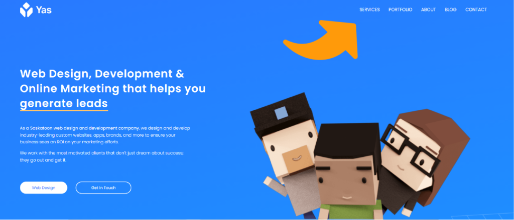
Most websites you see out there have their navigation (the links that lead you to other pages) at the top. The two most common arrangements are centered, or on the right side.
Here’s my navigation (on the right side):
Less common types of navigation do exist out there.
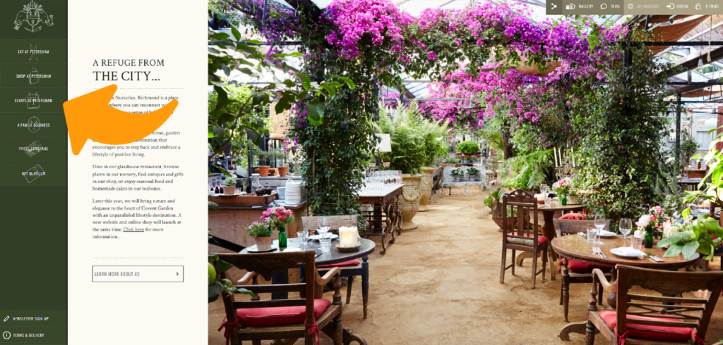
I found the following image in the article “10 Sites Doing Vertical Navigation Right” that shows an effective side menu. It’s important to note that this website is not bad (even though they’ve actually switched to a menu at the top since this screenshot was taken).
There’s room for these kinds of changes in websites, but you see them more on artist websites whose purpose is to provide an experience, rather than make a sale or get a contact form filled out.
https://www.webdesignerdepot.com/2017/06/10-sites-doing-vertical-navigation-right/
Looking at this image, it’s not difficult to figure out how the menu works, just like it isn’t difficult to figure out that the “push” sign means you should push a door. Your customers are still going to try to “pull” and when they’re only giving you a couple of seconds before they look somewhere else, it just may not be worth it.
Hamburger Menu on mobile and tablet
A hamburger menu is the little button that looks like 3 lines on top of each other (like two buns and a patty). It first came out in the 1980’s, but it has come and gone since then and is now widely used to show a menu that will open up once clicked.

It’s especially useful on mobile and tablet devices where there isn’t a lot of horizontal space to include all of your navigation items. This is one trend that’s becoming so widely known, we’re seeing it used on minimalist Desktop websites, either by itself, or paired with traditional navigation items when there are too many to list.
Design tip: Whenever possible, limit your main navigation to as few items as possible. The less choices people have, the more likely they are to go where you want them to.
Call to Action buttons (CTAs)
In the images above, you would have spotted some buttons that were immediately obvious to you.
Having a button (usually rectangular or pill-shaped) with some text on it is a recognized sign that this is a clickable element. It also helps if the button does something when you hover over it with your mouse. Changing color or growing slightly are great ways for your buttons to tell customers “I’m interactive”.
Conclusion
If you’re a local business owner, don’t make your customers think. There is a time and place for innovation and the “next big thing” in design, but you have to consider the risks of doing things too differently.
Capitalize on what we all know and what we’re used to and your customers will have a starting point to explore your content and offerings without feeling overwhelmed.
Don’t be the alien shower or the confusing, labeled doors in your industry; make it as easy as possible to browse your website and then make it even easier than that.

