I wanted to write this article because one of the most common questions I get while we’re building websites is “can you make my logo bigger?” I understand why so many people ask me this question, and it has a lot to do with what “Brand” means.
Outside of the branding industry (and sometimes even in it), it seems that the term brand has become synonymous with logo. I believe this is because logos are the most recognizable aspect portrayed in popular culture, while the rest is more difficult to understand and sometimes swept under the rug.
Let’s talk about the anatomy of a brand; we’ll start with the pieces you can see.
Logo
We’ll start with the easiest and work our way down. Yes, logos are absolutely a critical aspect of every brand. The more you see them, the more you build associations and brand recognition. Eventually, the logos of powerful brands can be recognizable on their own, like you see on every Apple store.
However, the power of logos must come from associations. Otherwise, they’re just an image.
Read the following sections and you’ll start to understand where these associations come from.
Color Scheme
Can you guess which companies these two shades of blue belong to? I’ll give you a hint: Social Media.

Of course, they’re Facebook and Twitter, and I’m sure many of you already knew that. How could you have known that?
Well, aside from the logo itself, businesses use very specific color palettes in most of their marketing to reinforce a sense of familiarity you have with their brand. A trend you’ll continue to see in branding is that the more comfortable you are with something you recognize, the more allure it has to you (think about how your eyes jump to brand-name products at the grocery store first).
**Design Note: Don’t fall into the trap of thinking your entire brand identity should be a single color. The best brands in the world work in other complementary colors and shades to break up otherwise monotone visuals.
Design Guidelines
Logos and colors are a part of design guidelines, but they’re easier to tackle on their own. Other than those two, design guidelines include everything like:
- Fonts
- Font Sizes
- Icon Sets
- Consistent images
For consistent images, it’s easy to imagine a website that uses real photography vs. illustrated graphics, but it can even be as specific as the type of light you find in that photography:
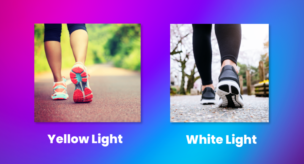
To the untrained eye, these photos look very similar, but once you see the difference between white light and yellow light, you’ll start noticing it everywhere (at least I did).
Design guidelines aren’t necessarily obvious, which means your familiarity with a lot of brands may go much deeper than you expect.
Now for the hard part. These are the aspects of a brand you usually can’t see:
Mission, Vision, and Values
Okay, so you can often see the Mission Statement, Vision Statement, and Values of a company, but these guidelines only have branding power if they’re consistent with people’s real world experience.
Take Elon Musk’s Tesla value “Respect the Environment”. This value reflects well on the brand not because it sounds like a good idea, but because it’s actually an important part of how the company operates. In fact, you can see that they create full environmental impact reports like this.
Communication Guidelines
Communication Guidelines describe how your team interacts with customers at any given time. You’ll see this in examples like:
- Your language on your website
- The way you speak to clients
- The way your team speaks to clients
- Your social media language
I remember in my first job, I had to answer the phone and say “It’s a great day at [Hardware Store] in [Location], how may I help you?” so if everyone I worked with answered that way, it would become something the customers would recognize and become familiar with (even if it sounded silly).
I also believe there is a wrong way to do this. When I go to the local movie theater, it’s pretty obvious that the employees behind the counter are following a script. They have to bring your attention to the snacks, which in theory is good marketing because that’s where they make most of their money. I even saw a few times that the employees were forced to gesture to the snacks with their hand.
The reason this doesn’t work (at least in my opinion) is that the employees are not aligned with the language they’re told to use. This happens often in large corporations where orders come from the top with a lack of context as to why it’s important to the company and therefore the employees. This will become more clear in the Perceived Brand section below.
Customer Experience
The customer experience takes everything we’ve talked about and wraps it into one unified experience. We don’t actively think of all the different parts that add up, but they all do. Some honorable mentions I haven’t already discussed include:
- The way a store smells (the hardware store I worked at smelled like tires. If this wasn’t a deliberate choice, they would have just stored them in a back room instead).
- The way a product sounds (Fun fact: Martinelli’s Apple Juice created a bottle that, when bitten, actually sounds like you’re biting into an apple. It sounds fake, but it’s not. Check it out)
- How bright or dark a store is
- How loud a store is (restaurants use loud music for several reasons, including making people want to eat and drink more)
- The temperature
The list goes on. Not every business has invested the time into understanding the psychology behind these aspects, but you’ll tend to find them more often in larger businesses and corporations.
That said, even if you don’t deliberately create your customers’ experiences, they’re still having them. Repeat customers might get used to the smell of your leather waiting chairs or the calming music in your spa. As long as those experiences are pleasant and consistent, they’re working in your favor.
Perceived Brand
Now for the hardest concept of all. Listen closely:
Your brand is not what you say it is; it’s what people understand it to be.
Maybe this is another reason people gravitate toward logos; they’re something you can have full control over. Everything else though, boils down to what you’re saying and what you’re doing.
You can say you put customers first, but if you have dozens of negative reviews, people are going to understand that putting customers first is not -actually- your brand.
We see this all the time, and it makes us feel… uneasy. This is a psychological concept called Cognitive Dissonance and it basically describes the discomfort of anything being different than you think it should be.
Put plainly, we get uncomfortable when we have contradicting beliefs about anything. If you have a friend that cancels plans all the time, it’s usually not a big deal because your expectations match the reality of the situation. However, it’s much worse when a friend that never cancels plans does so because your expectations do not match the reality of the situation.
This is extremely true for business. Remember in the 90’s when fast food restaurants were trying to promote healthy living through their ads? I remember it giving me a weird feeling as a kid as I thought, “Why are they doing that?”.
“Is My Logo Too Small?”
No, your logo is not too small. It’s important that it’s in your customer’s field of view, but they aren’t going to your website to look at your logo.
Your brand stretches to so much more, so you can rely on helping people build familiarity as long as your site is pleasant (easy to use) and consistent.
Focus on your customer experience. Help them get to the information they need to work with you and that will contribute to an overall positive experience, which is so much more powerful than a logo by itself.


Hi Zack,
Great video – Learned some things on colour and its importance that I hadn’t thought of before. Thumbs up.
Murray
I appreciate that, Murray!