Let me tell you how your Web Design benefits from you reading this article. You’ll leave today knowing the difference between Primary and Secondary Calls to Action, why you need them both, and some tips to make sure you’re using yours to reach your website’s goals.
Your website’s Calls to Action serve several purposes. These purposes include:
1. Easier Site Navigation:
We skim websites to quickly find the information we’re looking for. Not only can effective calls to action get us where we need to go, but you can cut down on long blocks of text by cutting off a preview with a “read more” button. Once someone has opted in to read more, you can comfortably give them all the info they need because you’ve taken them to the right place.
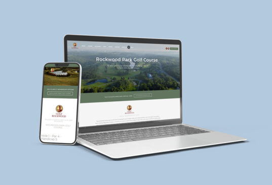
Check out this example of read more buttons from our site!
2. Nudging Viewers Into Action
It’s easy for all of us to be window shoppers—especially online. Calls to action such as “Buy Now” or “Sign Up Today” might be just the push your customers need to make their decision and stop sitting on the fence.
3. Defining Your Client Journey
Think hard about these two things.
- How your customers normally use your website
- How you want your customers to use your website
Use your calls to action to help your customers through both of these scenarios, or to change the first scenario to the second. For example, people might go from your homepage straight to your Services page to compare you to your competitors, but you realize that in your sales meetings, your team and experience are actually what set you apart and make the sale. In a case like this, you would want to actively lead people to your About page first.
There are two distinct types of calls to action you’ll use for your web design.
- Primary Call to Action
- Secondary Calls to Action
Let’s look at these two in-depth:
Primary Call to Action
Your Primary call to action follows the main purpose of your website. If you’re trying to get more leads, have a call to action that leads viewers to your contact form. Perhaps you’re trying to get more phone calls; have your phone number in your call to action. If your main goal is to save time by answering common questions, use your call to action to get your viewers straight to your FAQs page.
Here are some important tips:
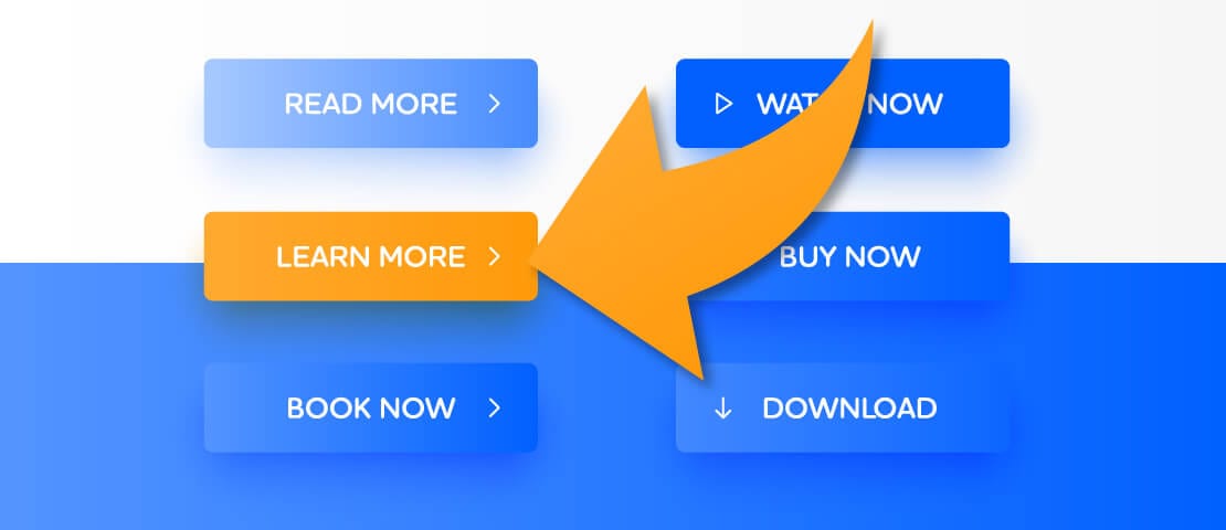
- Your primary call to action should be a different color from the rest to stand out so people consciously and subconsciously know what they’re supposed to be accomplishing during their visit.
- It should always be visible on your screen (at least on your desktop version). The easiest way to accomplish this is to keep one in your navigation.
- You should also have your primary call to action on your home page’s “above the fold” (the first section that loads on a screen) to complement your heading and subheading.
- When it comes to wording, the simpler the better. Anyone reading your call to action should know where it’s going to be taking them, so saying something common like “Get in Touch” or “Book an Appointment” is all you need.
Secondary Calls to Action
Your Secondary calls to action are better suited to help you meet the goals of each individual page. For example, you know that your average client journey involves visitors hitting your homepage, then visiting your about page, then learning about your services, and then heading to the contact page. Use secondary calls to action to help them along. Think, “Now that you’ve met our team, check out our services!”
Here are some important tips:
- Secondary calls to action aren’t meant to stand out the same way your primary one does. They should follow the color trends of the rest of your website and blend in.
- A page might have several different secondary calls to action. Imagine your home page has a snippet about your services and a snippet about your company’s history. Both of these snippets might have the same “read more” button, but they’ll take them to different pages.
- It’s acceptable for your secondary calls to action to be different from one another, too. “Meet our Team” and “Browse our Services” both still mean “Read More”, but they make it a little more clear what they’re accomplishing when clicked.
- Still try to keep these calls to action simple. Avoid using industry-specific jargon that new customers might not understand. You might think a phrase is clever and will set you apart from your competition, but a single person who doesn’t understand it could mean one less sale or lead for you.
Looking for even more info to master your Call to Action game? Check out this article published by InstaPage! Want more tips on improving your website, check out one of our latest articles, Top 8 Most Important Qualities of a Great Website.
Now that you’re set up for success, roll up those sleeves and give your Edmonton Web Design everything you’ve got!